How do I draw Frames?

To draw a Frame, click on Layout in the Toolbar, then select Frame. Now, you can click and drag anywhere on the Canvas.

How do I add images?

To add an image, select any Frame, and either double-click on it, or go to the Fill property. In the Fill property, switch to the image icon. Here, you can upload images.

How do I add videos?

To add a video to your site, click the “Insert” button and navigate to the “Media” section. Then, drag and drop a video component onto the Canvas.

Cross-Functional Design Process

Throughout the project, I collaborated closely with marketing, the founder, and developer to shape an end-to-end design process. Given limited engineering resources, I applied a semi-waterfall approach—designing, testing, and iterating before handing off to development.

“The discount is clearly shown at the top, so I immediately understood that everything in this section is 5%, and the other one is all 8%.”__Ting

Key Takeaways

  1. Designing Subscription Pages with Narrative Flow

    I learned to approach subscription page design like storytelling — ensuring each section has a clear purpose and flows logically. This helped guide users toward conversion by addressing their doubts and reinforcing trust through carefully placed CTAs.


  2. Lean MVP & Semi-Waterfall Collaboration
    With limited engineering resources, I adopted a semi-waterfall approach: designing, testing, and iterating before handoff. This method allowed me to validate key UX decisions independently and collaborate efficiently with developers.


  3. Leveraging Shopify Familiarity to Reduce Communication Gaps
    By working hands-on with Shopify, I developed a strong understanding of its template logic, reusable components, and flow constraints. This platform familiarity enabled me to design with technical feasibility in mind, reduce handoff friction, and deliver faster with fewer implementation issues.

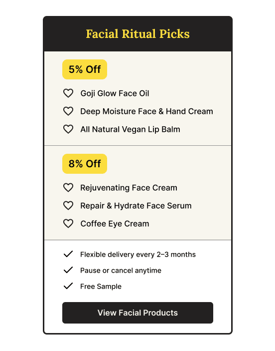
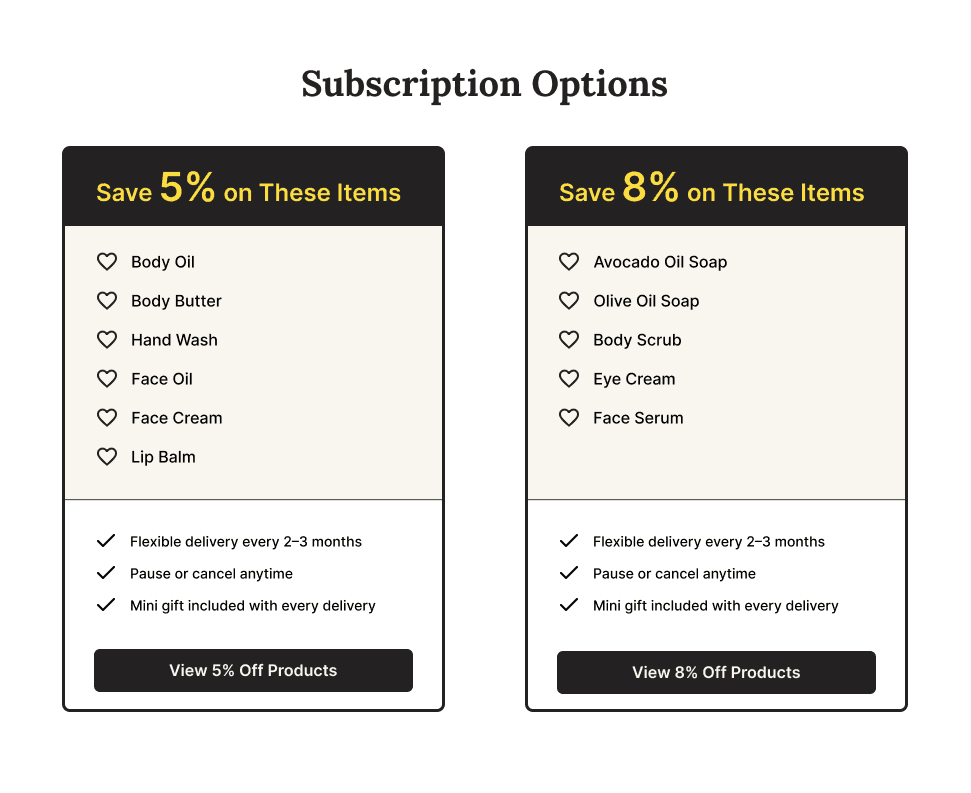
  1. Subscription Options – Reduce Friction

    Group plans by discount to simplify choice and reduce confusion

Original

Original

Iteration

Iteration

Design Thinking

Clear visual grouping by discount tier significantly reduced user confusion and hesitation. The original layout combined multiple discount tiers in a single card, which led to misinterpretation and delayed decision-making.

Iteration Process

To improve clarity and usability, I made the following changes:

  • Visually separated products into two cards (5% / 8%) to improve scan efficiency and reduce confusion

  • Simplified naming and removed overlap to reduce cognitive load

  • Outcome: All 5 users clearly understood the pricing and selection flow after the redesign, as confirmed through usability testing.

Business Opportunity

The subscription page is a key touchpoint for boosting user retention and brand loyalty — effectively driving recurring revenue growth.

Challenge

Defining the Design Scope Through Subscription Conversion Gaps

Based on this finding, I proposed designing a dedicated subscription landing page to address the information gap, reduce user hesitation, and increase subscription conversions.

Without a product manager, I conducted a competitive analysis and found that most skincare brands use dedicated landing pages to clearly communicate subscription benefits, flexible options, and pricing — ultimately guiding users toward conversion.

By comparison, our site only featured a single subscription button on the product page, with insufficient information or persuasive content, which led to user uncertainty and hesitation.

Define Design Scope

Bridging Subscription Confusion Through Clearer Content Design

When reviewing our subscription flow, I found that the product page offered minimal explanation of recurring pricing or value—just a single button. Drawing on a competitor audit, I saw that leading skincare brands often use full landing pages to explain subscription perks like savings, flexibility, and product education.

Based on these findings, I proposed and designed a standalone subscription page to reduce friction, support decision-making, and improve conversion outcomes.

By comparison, our site only featured a single subscription button on the product page, with insufficient information or persuasive content, which led to user uncertainty and hesitation.

Business Opportunity

The subscription page is a key touchpoint for boosting user retention and brand loyalty — effectively driving recurring revenue growth.

Design Concepts

Motivating Customers to Take Action on Subscriptions

  1. Hero Section – Prompt Action

    Highlights key benefits and strong CTA to capture attention

Design Thinking

Surface subscription value at first glance by combining clear incentives (e.g. discounts), concise benefit highlights, and a strong CTA—structured with intentional visual hierarchy to guide user attention.


I created this illustration to grab attention and express the brand’s tone of calm, independence, and mindful rituals.

Problem Statement

How might we make subscribing feel easier, more flexible, and truly worth it for our customers?

Problem Statement

How might we make subscribing feel easier, more flexible, and truly worth it for our customers?

How might we make subscribing feel easier, more flexible, and truly worth it for our customers?

64% expressed concern about product accumulation or uncertainty about when they would run out.

Survey

69% worried that canceling or pausing a subscription seemed too complicated.

Survey

Most people mentioned a lack of strong motivation to subscribe in the first place.

Interview

Mumu Bath

Designed a landing page that increased customer action — resulting in a 25% increase in subscriptions during the pilot phase.

Duration

5 Weeks

5 Weeks

Tools

Figma

Adobe Suite

Shopify

Procreate

Figma

Adobe Suite

Shopify

Procreate

Team

Product Designer (Me)

Brand Illustrator (Me)

Founder

Front-End Developer

Marketing Specialist

Product Designer (Me)

Brand Illustrator (Me)

Founder

Front-End Developer

Marketing Specialist

Skills

User Research

Competitive Analysis

Wireframing

Web UI/UX

Brand Illustration

Responsive Design


User Research

Competitive Analysis

Wireframing

Web UI/UX

Brand Illustration

Responsive Design


About Company

About Company

The brand launched a subscription promotion feature, but it has not resulted in the expected growth in subscriber numbers.

Mumu Bath is an e-commerce company specializing in handcrafted skincare, bath, and fragrance products. With a strong focus on natural ingredients and high-quality formulations, the brand has built a loyal customer base that values wellness and sustainability.

Problem

Problem

The brand launched a subscription promotion feature, but it has not resulted in the expected growth in subscriber numbers.

Solution

Solution

Conduct the survey research from loyal customers, and design a landing page to help navigates and motivates them to set up the subscription.

Research shows that while 67% of our loyal customers use our products daily, only a small percentage have subscribed.


Research Insights

Research Insights

Research shows that while 67% of our loyal customers use our products daily, only a small percentage have subscribed.


  1. Usage Guide – Ease Overstock Concerns

    Structured information supports confident estimation of product lifespan


Original

Original

Iteration-1

Iteration-1

Design Thinking

A clear content hierarchy—from volume to feedback—was designed to reduce confusion around instructions. Key details like frequency and duration were highlighted to help users estimate product lifespan and feel more confident subscribing.

Iteration Process

To improve clarity and usability, I made the following changes:

  • Transformed unstructured text into a modular layout for better readability

  • Categorized content into five key sections: volume, frequency, duration, ingredients, and feedback

  • Introduced hover-triggered tooltips to reveal secondary details without overwhelming the interface

  • Applied consistent layout, icon, and typography to improve scanability and reinforce hierarchy

  1. Setup Guide – Reduce Hesitation

    Concise visual steps reduce uncertainty and highlight flexibility

Design Thinking

To reduce user hesitation caused by perceived complexity, I designed a concise 3-step visual guide to support decision-making and build trust.

While some users worry about being locked into a subscription, it’s important to reassure them of flexibility — without exposing too much operational logic.
The copy and visual cues are carefully designed to build trust, while preserving the value perception of the subscription.

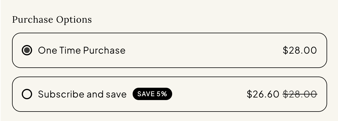
  1. Pricing Cards – Drive Conversion

    Visual pricing strategy simplifies choices and supports user commitment

Design Thinking

To prompt quick decision-making and build trust, I used discount labels and visual pricing differences alongside clear subscription frequency options. To align with different product usage cycles, I offered two simple delivery frequencies—every 2–3 months or 5–6 months. This streamlined approach avoids overwhelming users while still giving them control, making subscriptions feel more relevant and easier to commit to.

“Seeing the instructions for usage frequency and duration increased my willingness to subscribe, as it quickly helped me assess my personal needs.”__Janet

“Seeing the instructions for usage frequency and duration increased my willingness to subscribe, as it quickly helped me assess my personal needs.”__Janet

“The first section clearly shows the key benefits of the subscription, which makes me want to explore the content further — and the illustration really draws me in.” — Emily

Designed a landing page that motivated customer action — resulting in a 25% increase in subscriptions during the pilot phase.